
UTS Insearch Current Students Web Design
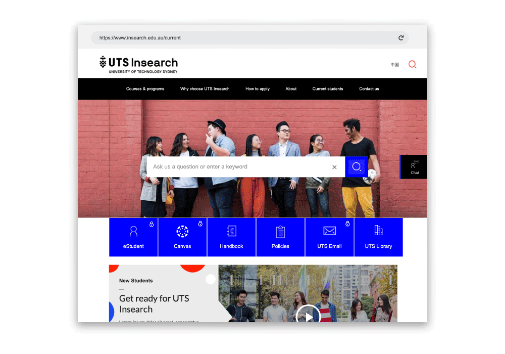
Disruptiv designed an intuitive website to improve the user experience for students who will use the website to register for social events, check their timetable, engage with other students online and so much more.

Taking an Iconic Brand to a New Level.
The goal was to modernise UTS Insearch – working with its existing structures while providing a needed facelift. With a focus on improving the student experience, Disruptiv set out to give students the power to control their own user experience. The new website was set out to encourage students to embrace their uni life as well as to embrace UTS as the iconic brand it is.
Old design
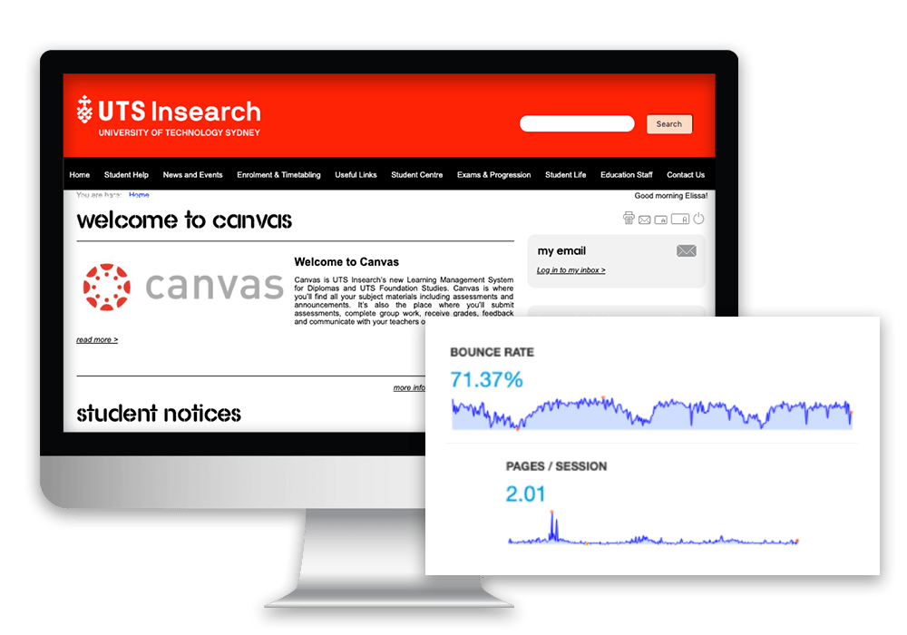
The Why
– Bounce rate for extranet (Current website) was very high 71.37%. Users were typically visiting only 2 pages (250 page website).
– Top visited pages in 2018: Timetabling, Academic Calendar, Student Support and Exam Info.
– During enrolment season, important dates were listed in Top 10 occasionally, which needed desperate improvement.
Our process
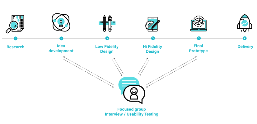
Our process
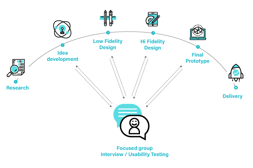
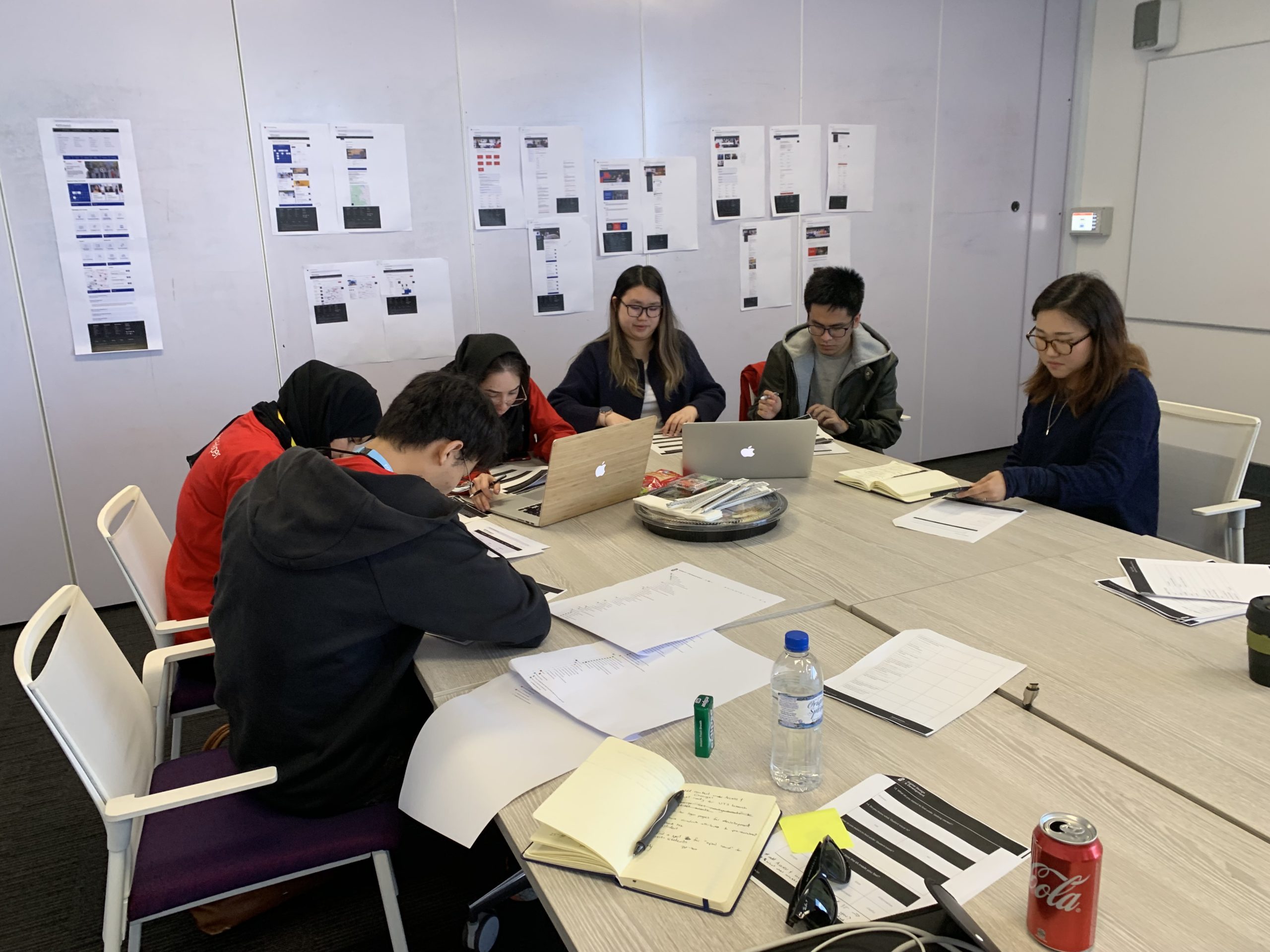
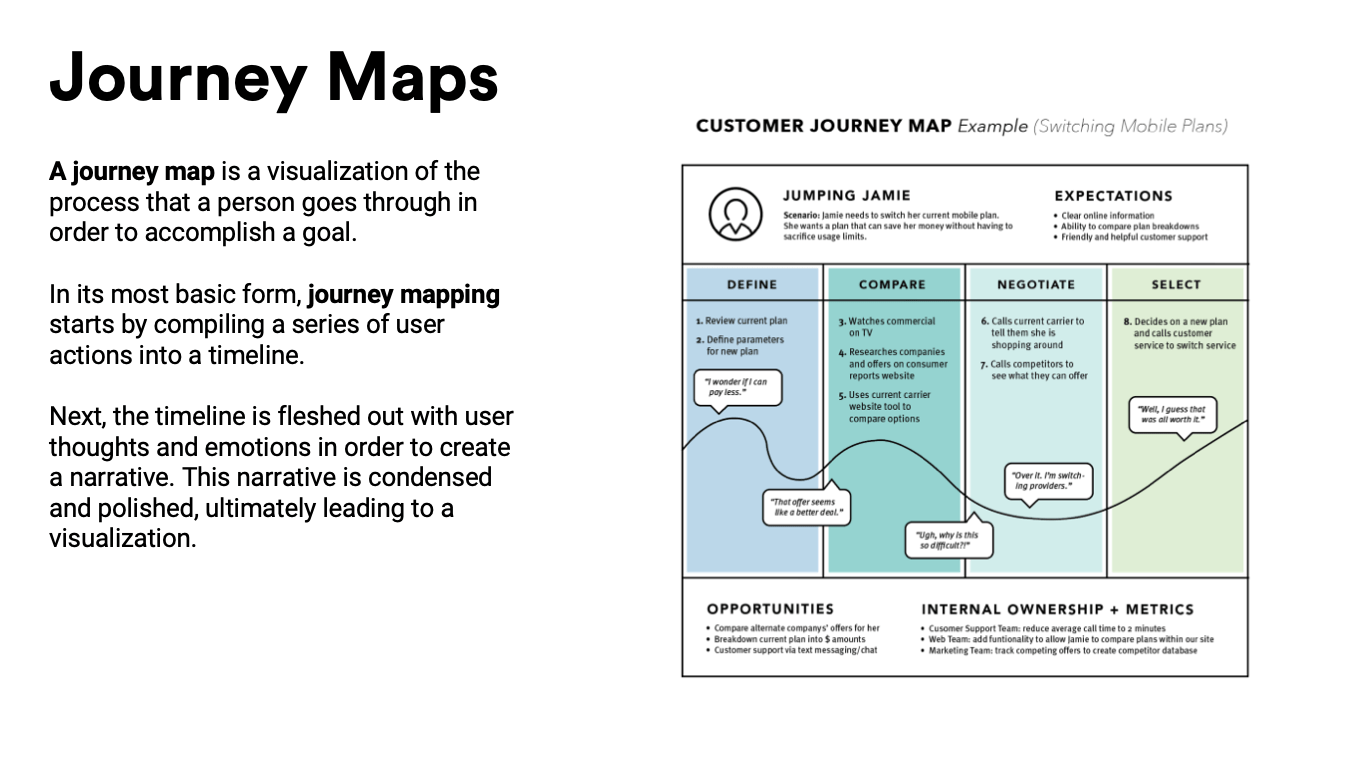
Step 1: Research
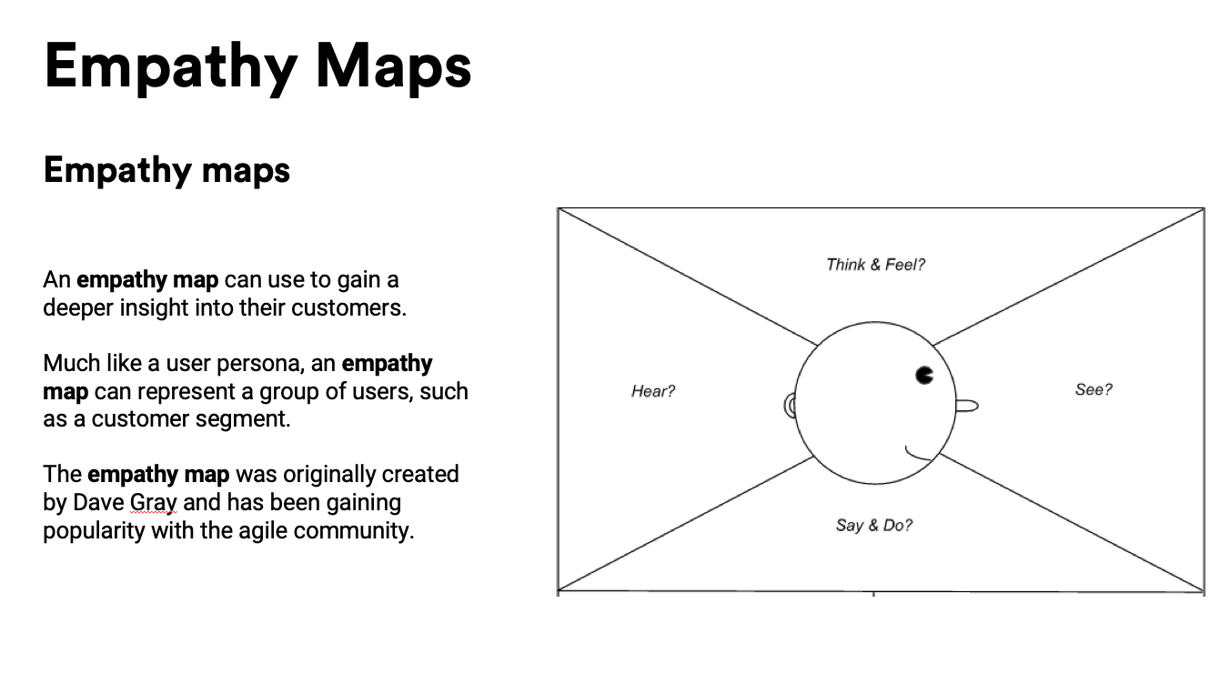
- Empathy Maps
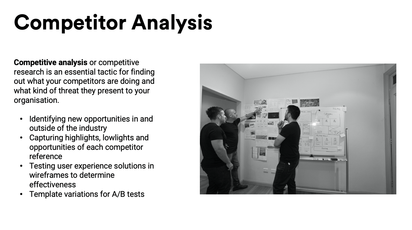
- Competitor Analysis
- User Journey Maps
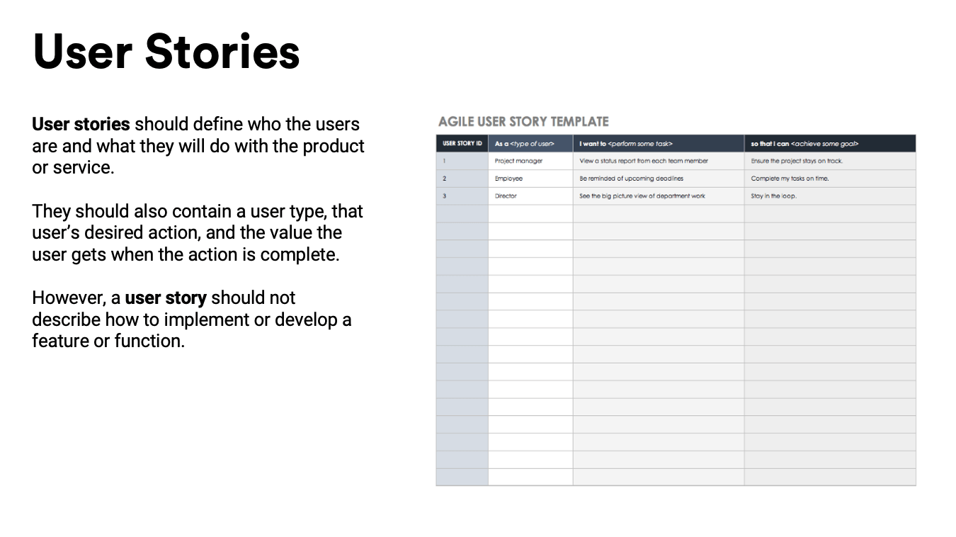
- User Stories
- Focus Group (Capture Pain Points)
Step 2: Idea Development
- Present concepts
- Content Audit
- IA (Information Architecture)
- Student Survey
- Final User Journey Maps
Step 3: Low Black & White Design
- Design Low Fidelity Wireframe
- Prototype Testing
- Approval & Feedback
Step 4: High Colour Design
- Design High fidelity wireframe
- 1:1 User Testing
- Approval & feedback
Step 5: Delivery
- Iterations & Finalisation
- User Acceptance Testing
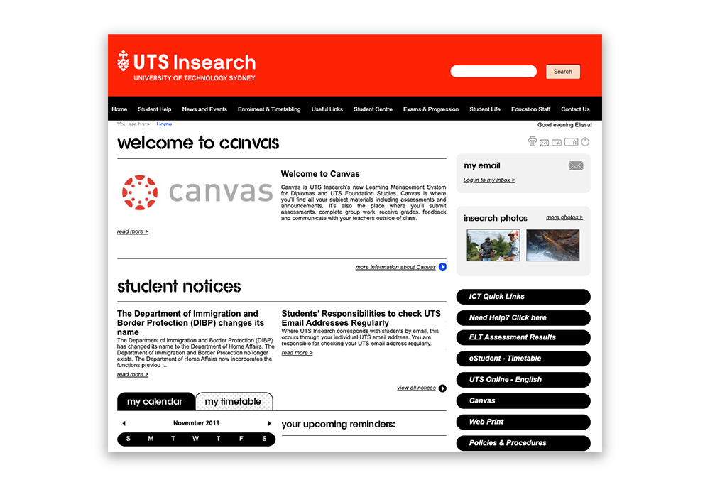
Poor navigation
Challenges
Users could not find information when and where they needed it.
- Different audience groups
- Poor navigation
- Content engagement & content gaps
- Not mobile friendly
- Outdated design
- Disorganised layout
- No real-time support
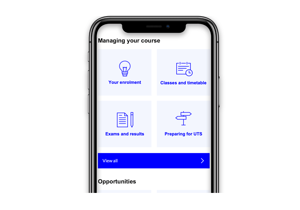
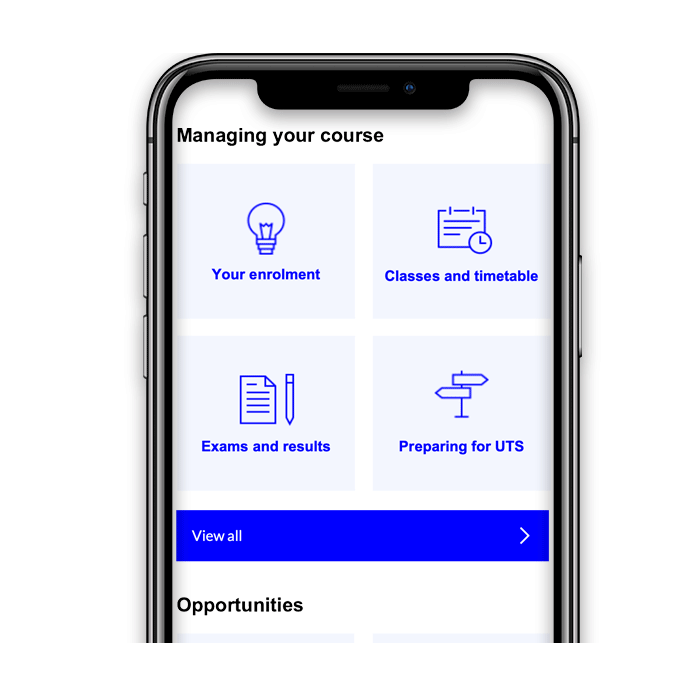
Solution
Modular & Responsive.
We built a series of responsive modular content widgets, designed to work on any device, anywhere on the site. These widgets encourage users to engage and explore, while adding a touch of personalisation.
- User focused sitemap, organised layouts, use of imagery & multimedia content
- Mobile first design
- Human centered design & creative use of brand
- Communicate with students in channels that they are accustomed to

Auto-complete search
Ergonomic ‘thumb-friendly’ navigation

Auto-complete search
Ergonomic ‘thumb-friendly’ navigation
New drop-down menus designed to improve navigation

Interactive campus map

New drop-down menus designed to improve navigation

Interactive campus map

Calendar widget with every type of event, designed to work on any device, anywhere on the site.
Work With Us.
Takeaway
We believe connecting with real users, asking the right questions to help our experts design the right solution the first time, every time. The most important part was knowing which questions to ask and what to present to students in the focus group to ensure information was actionable and on point.
Usability testing is an absolute key.
We’d like to thank and appreciate all the stakeholders and students for their support and feedback throughout the UX/UI process.