Little Kids Jumping Castles eCommerce Website
Disruptiv designed and built a new feature packed eCommerce website in Magento to improve conversion, reduce the cost of acquisition, automate order processing and improve organic traffic.
Background
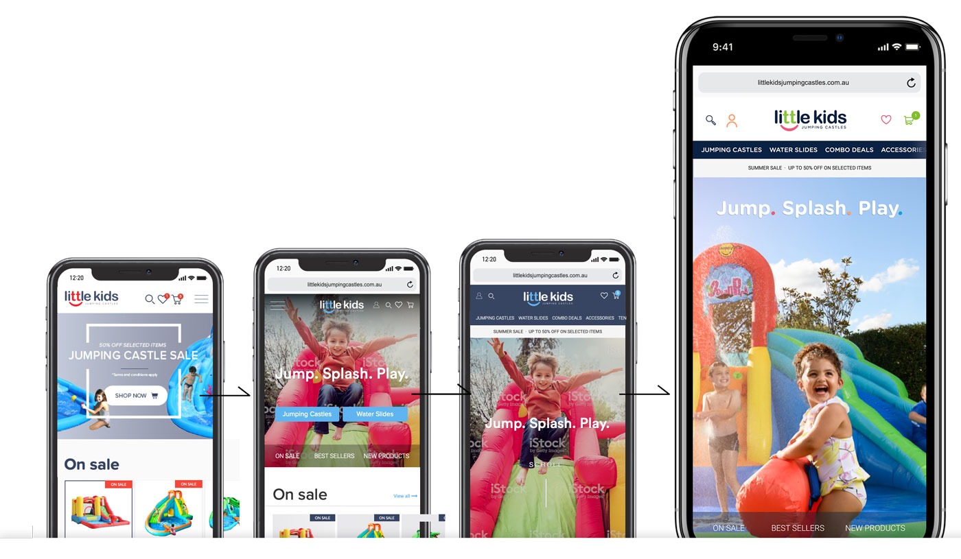
Disruptiv was approached by Little Kids Jumping Castles after reaching a plateau in online sales, brand awareness and conversions. Little Kids Jumping Castles wanted a digital design & development company that could expand their already wildly successful product Happy Hop Jumping Castles & Slides to new and emerging markets. We refreshed their current website with new branding, photography and a one-step checkout. The aim was to transform the Little Kids Jumping Castle’s website which was designed to accommodate their products as well as to build their brand awareness online.
Old design
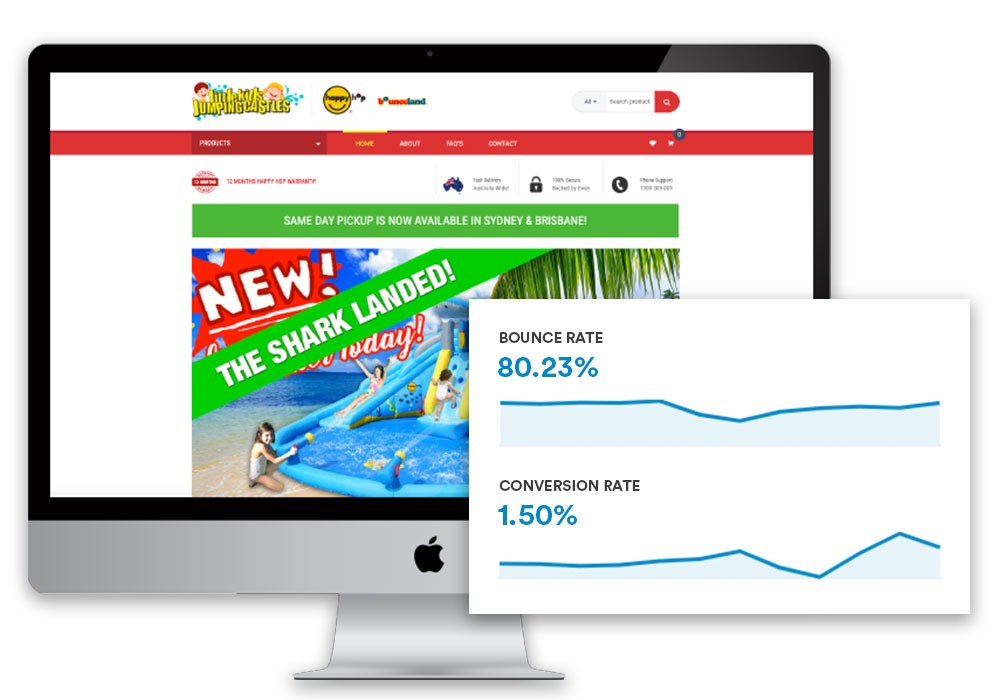
- Conversion was way below benchmark, sitting at 1.5% (against 3% benchmark).
- Bounce rate for the old website was very high – 80%. Users were typically visiting only 1 page and leaving.
- Cost of acquiring a new customer was too high – $96 per sale.
- We had to find a way to stimulate a second purchase – customers were only purchasing one product & never returning – Repeat customers are 10x less expensive and have a 65% higher chance of converting.

Our Process
Step 1: Research
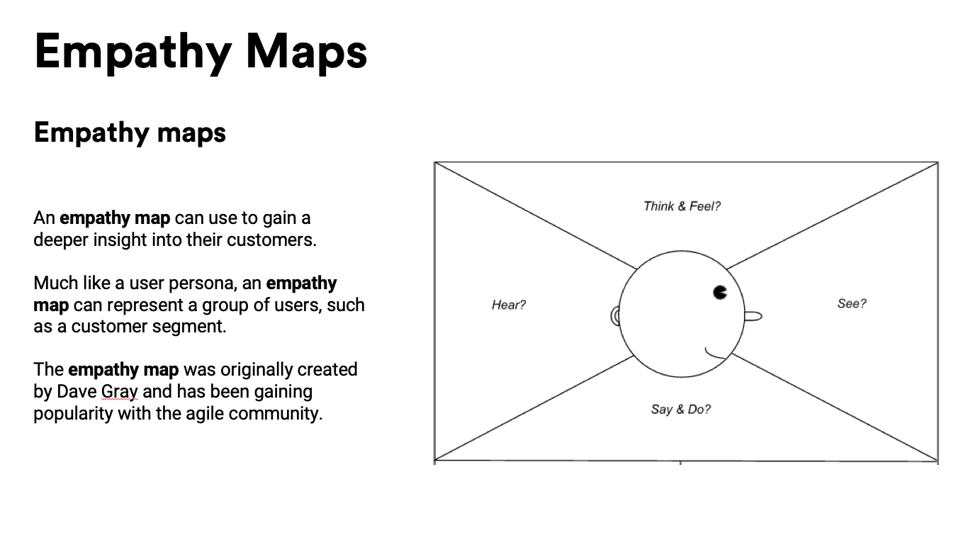
- Empathy Maps
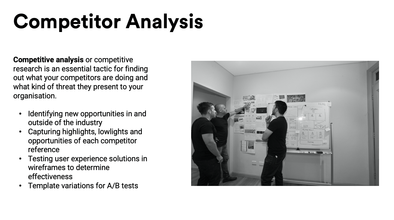
- Competitor Analysis
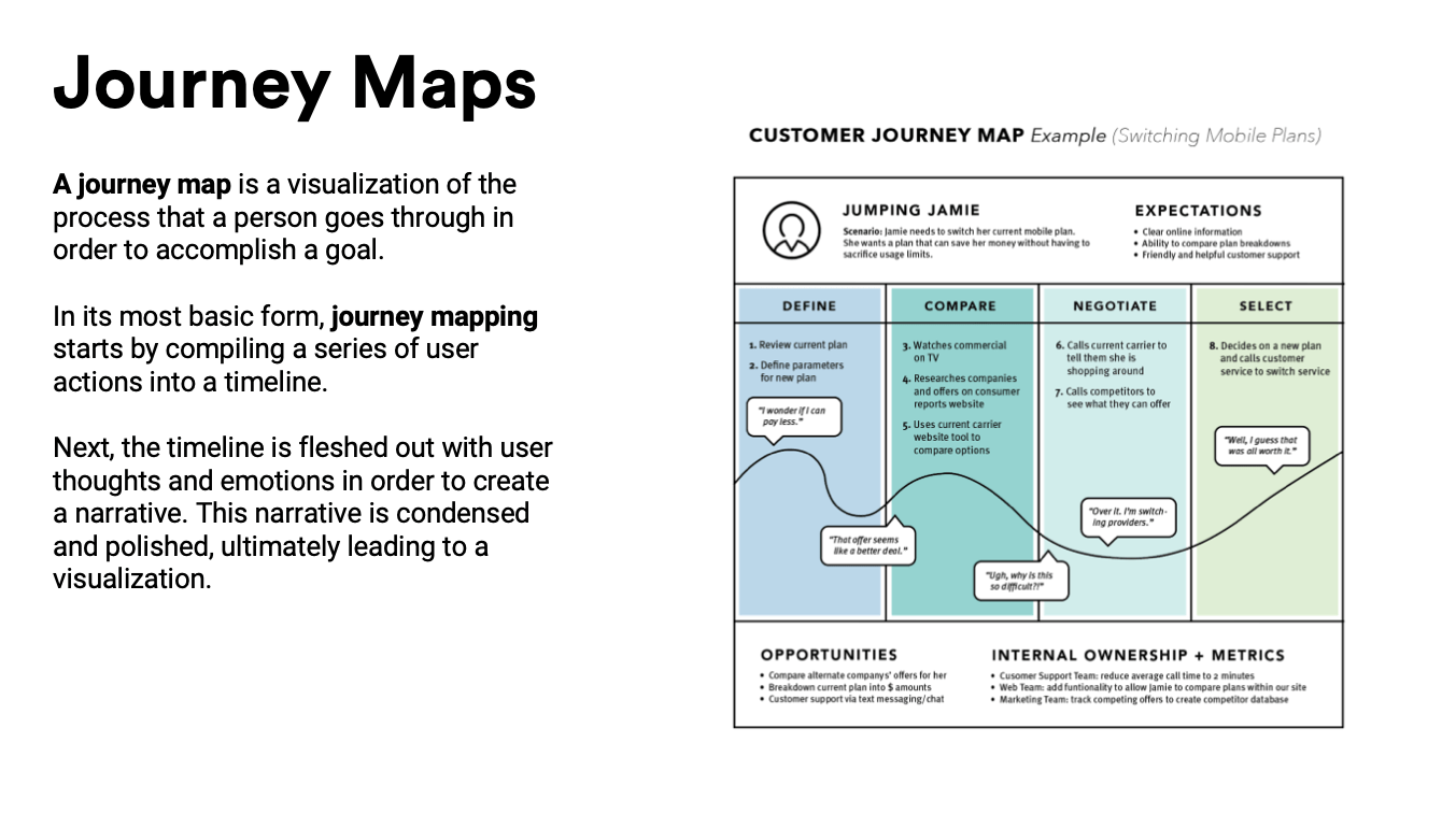
- User Journey Maps
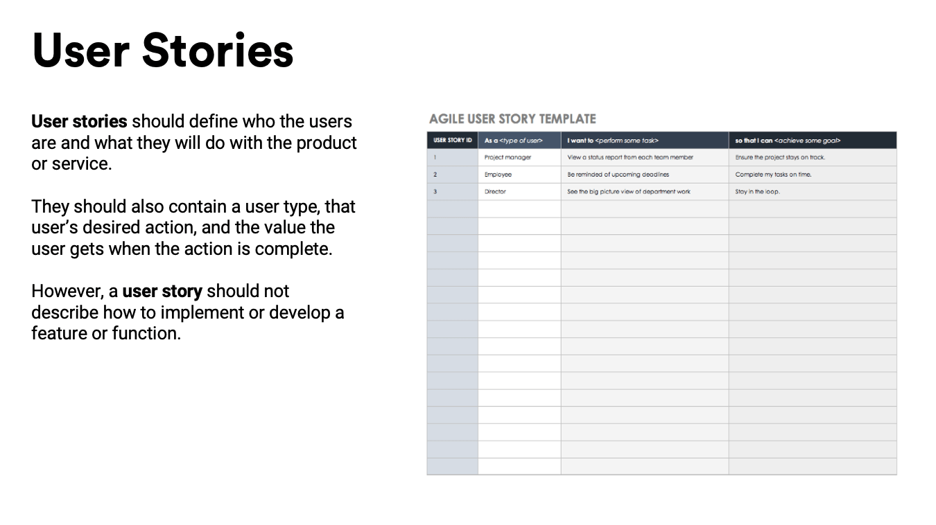
- User Stories
- Focus Group (Capture Pain Points)
Step 2: Idea Development
- Present concepts
- Content Audit
- IA (Information Architecture)
- User Interviews
- Final User Journey Maps
Step 3: Low Black & White Design
- Design Low Fidelity Wireframe
- Prototype Testing
- Approval & Feedback
Step 4: High Colour Design
- Design High fidelity wireframe
- 1:1 User Testing
- Approval & feedback
Step 5: Delivery
- Iterations & Finalisation
- User Acceptance Testing
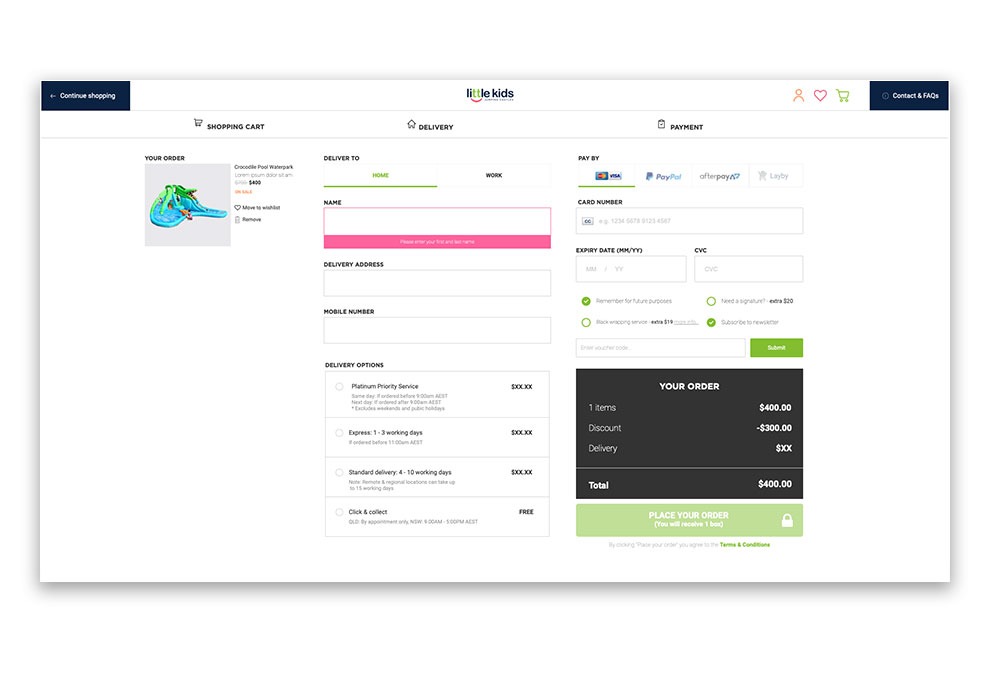
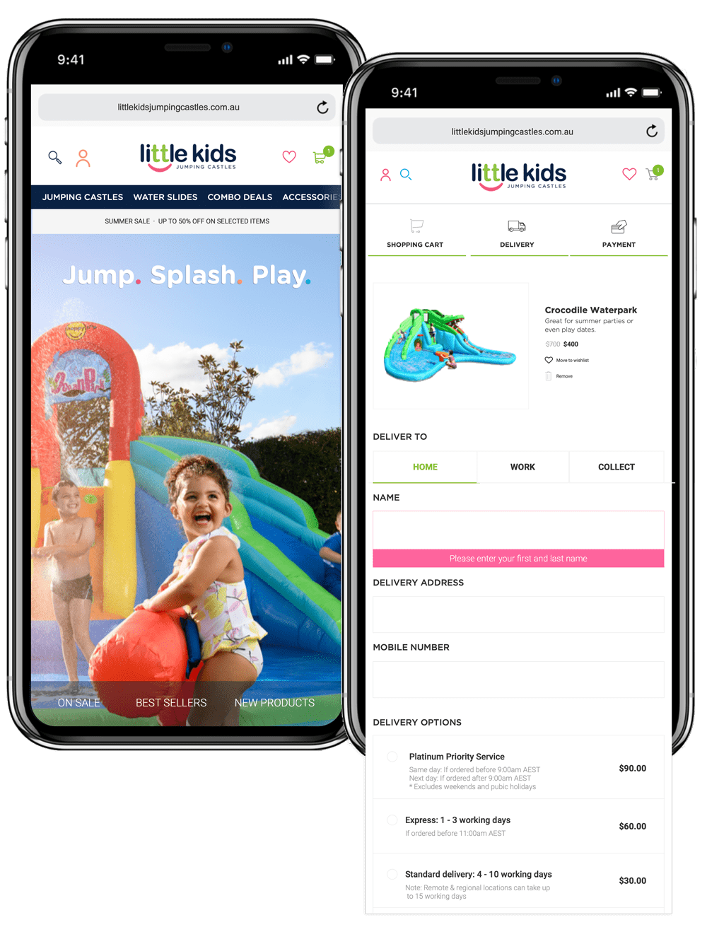
New One Step Checkout
Challenges
Generate more sales with the same advertising budget
- Improve conversion
- Improve organic traffic
- Poor navigation and filters
- Stimulate second purchases from existing clients
- Not mobile friendly
- Outdated design
- Disorganised layout
- Brand failed to connect with customers in a real way
Solutions
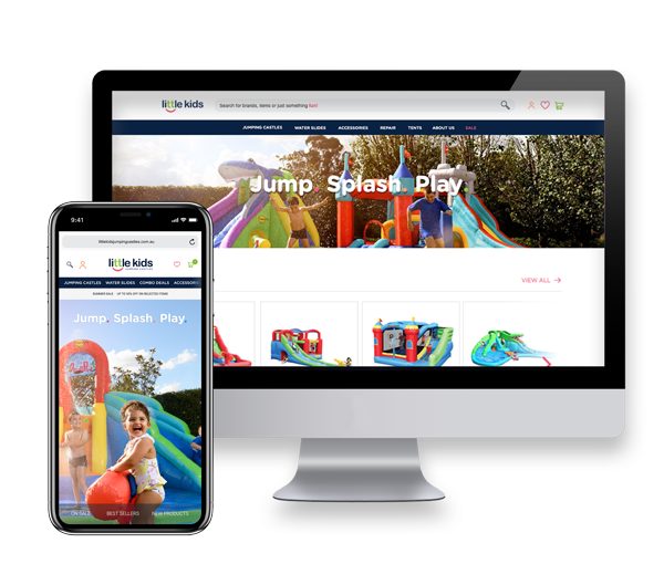
We set out to build a user-friendly website
Our goal was to build a website which was modern, on-brand and user-friendly. We started off the project by developing a service blueprint. A customer journey map specifies all the interactions that a customer will have with a business throughout their customer lifecycle – the service blueprint goes a bit deeper and looks at all the interactions both physical and digital that support those customer interactions and adds a little more detail to the mix. This helped us decide on key areas of improvement and how to construct a technical architecture around their current business process and existing technology.
We created easy to navigate menus and product categories as well as a one-step checkout. We also implemented a freight integration system as our client previously had to manually input the orders to their freight supplier’s system. We automated the process and the freight integration system is now integrated with their freight partner. This has removed the mundane task of manually inputting orders.
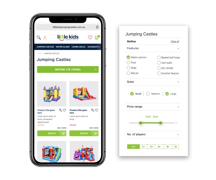
New Search / Filters
Design Concepts
Billions of retailers around the world are fighting to get customers attention, which is why it’s more important than ever to break through the noise to capture attention through clear, effective and persuasive messages. With this mission we set out to find Little Kids Jumping Castles key persuasive message. What were they actually selling? That moment when their child opens that perfect gift and they get excited, this is where the tag line ‘That perfect gift every time!’ was born.
Solutions
The brands that connect with their customers in a real way will win... every time!
We set out to connect with their customers on an emotional level. We produced a photoshoot and TV Commercial for use across all digital mediums. From a digital point of view, we were looking to reduce the bounce rate by being less pushy and more real. From a brand equity stand-point the strategy was to highlight their products in a way which a Facebook ad or hot special just can’t, by showing the emotion of the user (the kids) as they slid down the jumping slide, laughed with their friends and opened their present for the first time.


